Get the most out of Connect
Excellent user experience (UX) can help your users understand the value of open banking, especially as it is still in its infancy in the public financial services industry. YouGov’s research has identified that security and data misuse are key barriers to using open banking. Applying good User Experience and behavioural science theory is crucial to reducing these perceived barriers.
This guide will discuss ways to help you maximise your adoption of open banking prior to the Connect journey.
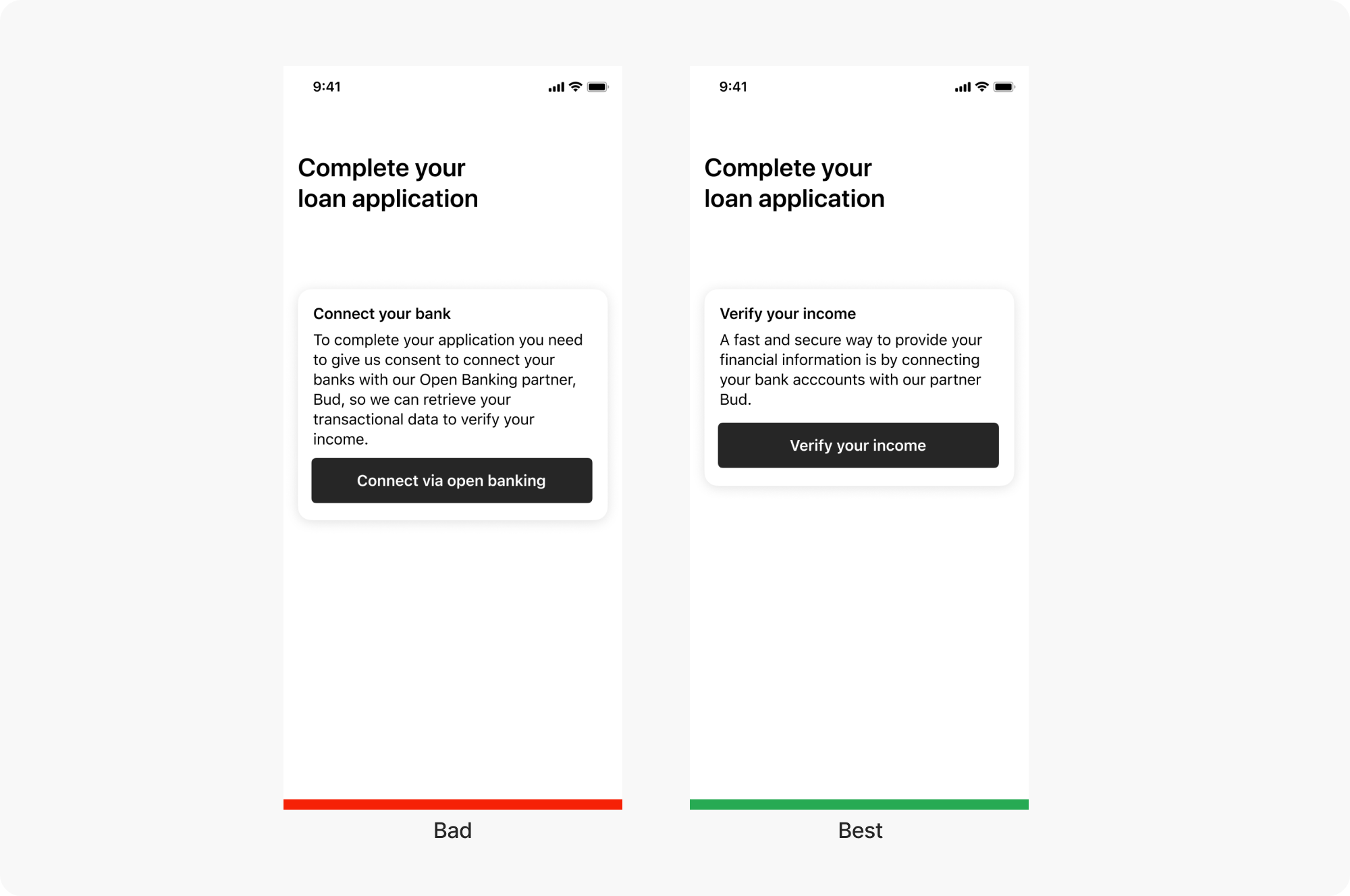
Use value-focused messaging
When talking about the Connect flow and open banking technology to customers, focus on using language that highlights Connect's value; this helps customers see the benefits more clearly.
It’s helpful to avoid using phrases like “open banking” as it’s an unfamiliar phrase to most users.

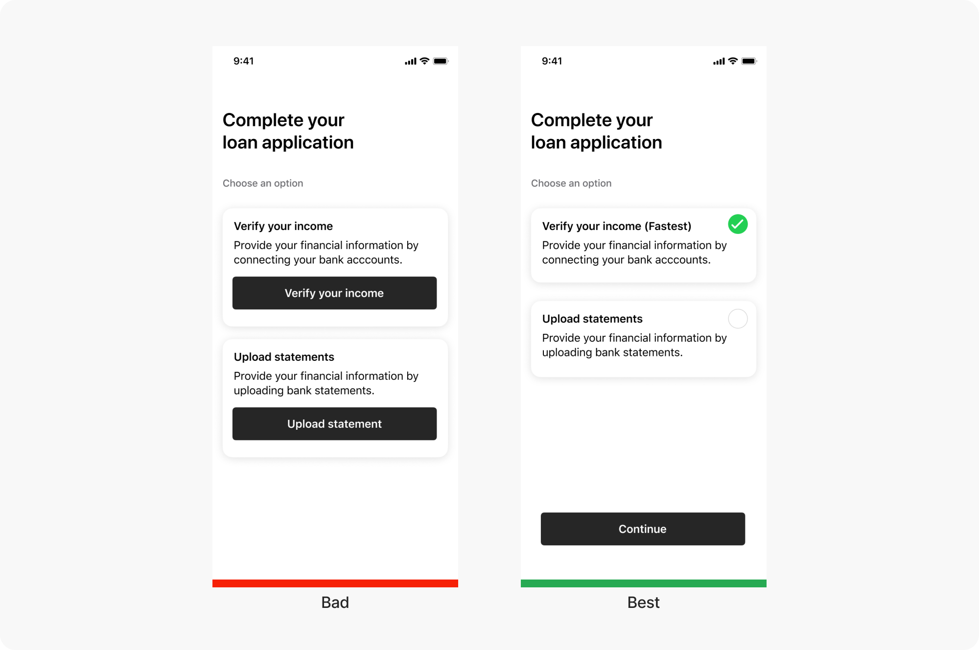
Make Open Banking the default option
If you’re implementing the Connect flow alongside manual ways for users to send you data, consider making open banking the default option. People tend to pick the easiest option to avoid complex decisions. Defaults provide a cognitive shortcut and signal what people are supposed to do.

Use priming screens to reduce uncertainty
People feel more comfortable doing something if they understand what’s going to happen next. Introduce users to Bud on the preceding screens and be clear if they are transitioning between the app to enter the Bud Connect Flow. These screens help the customer at ease and allow them to be confident when progressing through the journey.
Provide a redirect URL
When embedding Bud Connect into your web or mobile experience you will need to provide a redirect URL which will take your user back into your environment after completing their Open Banking connection through Bud Connect. This ensures your users both start and finish in your environment, seamlessly flowing in and out of the Bud Connect experience.
Apply these best practices to other touch points
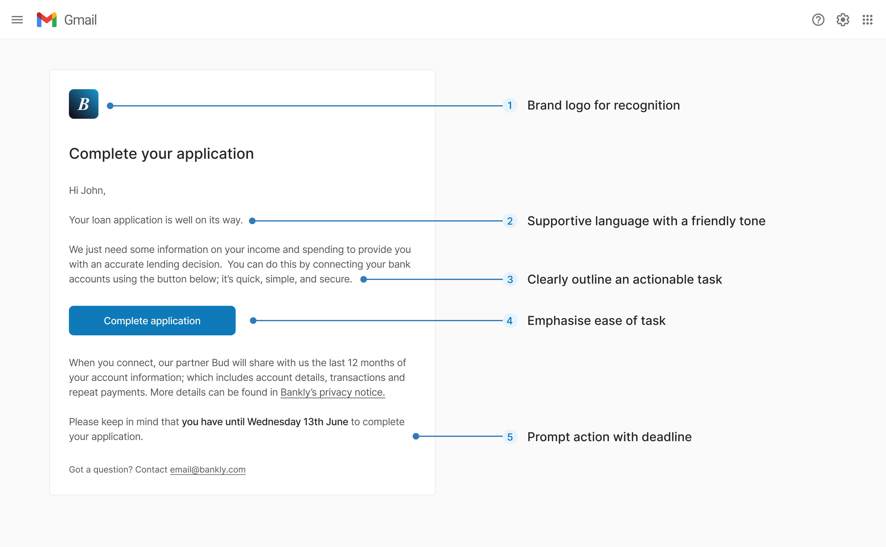
When talking about the Connect flow in other customer-facing touch points, it’s important to keep the language consistent. Looking to invite customers to connect their accounts over email? We’ve put together an example email that uses the same UX principles to encourage customers to connect their accounts.

If you have any questions, please contact us via the chatbot (bottom-right of screen 👉) or via a support request or check our FAQs.
Updated 7 months ago
